Renko Time and Time Between Candles Indicator
This software component for MetaTrader 4 is built to enhance the capabilities of your trading environment. This technical indicator acts as a specialized analysis tool designed to visualize market data. It helps traders identify emerging trends, momentum shifts, and key support or resistance levels by plotting statistical calculations directly onto price charts.
How to Setup and Use Renko Time and Time Between Candles Indicator
1. Installation: Place your file in the MQL/Indicators folder via "Open Data Folder" and restart your terminal.
2. Loading: Find the indicator in the Navigator, drag it onto your chart, and configure the input parameters in the popup window.
3. Customization: Press Ctrl+I to open the indicator list, select your tool, and click "Properties" to change colors, levels, or visual styles.
4. Updating: Replace the old file in the Indicators folder with the new version and restart the platform to apply changes.
Frequently Asked Questions
Q: Why is my indicator not showing? A: Verify the file is in the MQL/Indicators folder, or try right-clicking the "Indicators" tree in the Navigator and clicking "Refresh."
Q: Do custom indicators slow down the platform? A: Too many complex indicators can impact performance; remove unused ones via the "Indicator List" (Ctrl+I).
Q: Can I use MT4 indicators on MT5? A: No, MQL4 and MQL5 are distinct languages; ensure the indicator is compiled specifically for your platform version.
Description & Settings
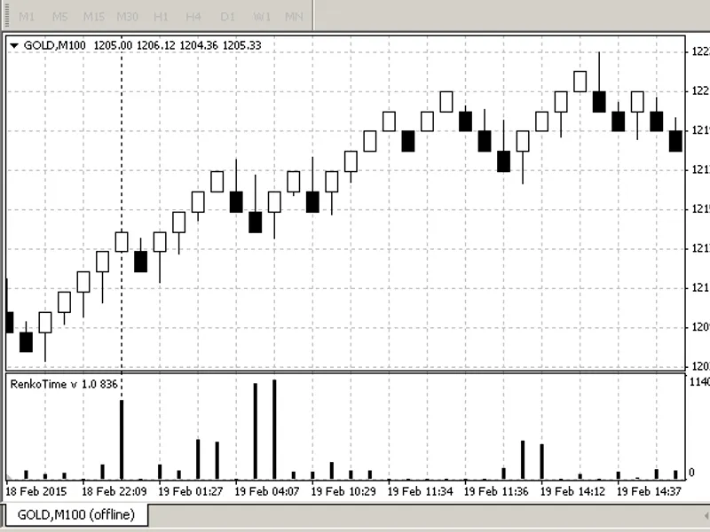
A very simple indicator to display the difference in time between candles in seconds.
Intended for use with offline renko charts to indicate how long each block or brick has taken to form.
On a regular timeframe chart, it can indicate dropped candles because the subsequent candle starts late.
My first indicator! Please comment!
Long indicator bars at the period separator as market closed.
You might expect indicator bars to be double height where the renko colour changes as the price has had to move twice as far to make the block.
My guess is that when the market moves then the bars are small, indecisive market produces longer bars as price takes longer to move.
On a regular timeframe chart, it can indicate dropped candles because the subsequent candle starts late.
Here, news was out at 15:30 but the candle was skipped so the 15:31 candle took 120 seconds to start, counted from the start of the previous (15:29) candle.
Comments:
Seems odd to put the time element back into renko charts but I figured it might produce useful information such as slow bricks indicating a turn in the market or price moving slowly inside a range. Or fast bricks indicating a real move in the price.
On a regular, standard timeframe chart, it can show where the chart / broker has skipped one or more candles. This is surprisingly often! Particularly at news times.
Added MA as requested.